Welcome to Bigsteps!
We would like to thank you for purchasing Seiko eCommerce HTML5 Template!
Before you get started, please be sure to always check out this documentation.If You have any questions that are beyond the scope of this documentation, please feel free to submit ticket to http://help.big-skins.com/
We're very happy to help you and you will get reply from us more faster than you expected.
Thank you, we hope you to enjoy using Seiko eCommerce HTML5 Template!
Getting Started
Installation
Follow the steps below to get started with your site template:
- Open the html folder to find all the Templates Files
- You will need to upload these files to your web server using FTP.
- Make sure you upload the required files/folders listed below:
- html/css - stylesheets folder
- html/images - images folder
- html/js - javacripts folder
- html/fonts - fonts folder
- html/index.html - index file/homepage
- Now you can start adding your content.
HTML Structure
Seiko Template follows a simple HTML code structure for every page. Here is the sample:
...
Seiko Template supports boxed & fullwidth layouts. Adding the class .boxed or .fullwidth to the body will make your site boxed or fullwidth.
Without reference to body layout you can make header, footer and each .block boxed, fullwidth or fullboxed by adding .boxed, .fullwidth or .fullboxed class.
See the image below:

Color Schemes
If you want to change your website's color scheme
1. link the stylesheet file css/style-color-*.css in head section
2. add the corresponding class to body.
              ...


              ...
Make sure you add the style-color-*.css stylesheet in your head after the style.css stylesheets.
If you use less, you can compile the new style.css after changing colors variables in the file theme-variables.less
Changing Fonts
Seiko Template uses three external fonts: Raleway, Roboto & Oswald from the Google Fonts Library by default.You can find the link to the font files in the head tag of the HTML files.
If you want to change the Google Font, you will need to edit the above links with your own font. If you want to use self hosted font, remove these links completely. Icons Font
Seiko Template uses simply and flexible icon library IcoMoon.
IcoMoon is striving to build and provide the best iconography and icon management tool for perfectionists.
If you want to add new icon to the library follow instruction, provided below:
1. Go to IcoMoon - Free -> Click Import Icons -> Upload there font/icomoon-reg/selection.json -> Select 'Yes' in modal window:
All Seiko icons will be imported!
2. Then select new icon(s)
3. Generate your custom font
4. Download new Icons Set, unzip archive and copy all files to 'font/icomoon-reg/' folder of your project
5. Find new icon in demo.html and use it in your html code
For example like this:
Grid
Seiko Template uses Bootstrap Grid.
For more details on the Bootstrap Grid, please visit its official website.
Page Preloader
Seiko Template uses full screen overlay with animated icon while page loads. If you want to remove it add class="off" to #loader-wrapper
...
Headers
HeaderTypes
You can choose between 9 types of headers while creating your pages. The list of header type & its descriptions are provided below
| Header Variant | Style class | Description | Image | Code |
|---|---|---|---|---|
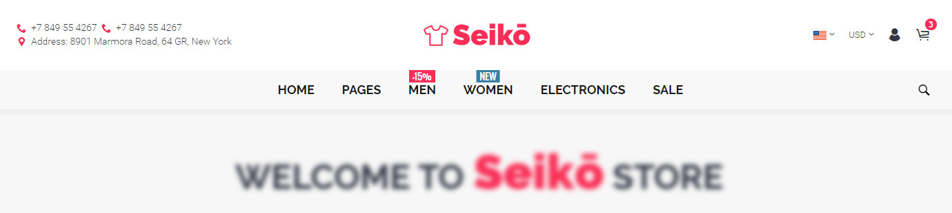
| Variant 1 | .variant-1 |
One row light, top margin |  |
ShortCode |
| Variant 2 | .variant-2 |
One row light |  |
ShortCode |
| Variant 3 | .variant-3 |
One row dark |  |
ShortCode |
| Variant 4 | .variant-4 |
Three rows
phones block, addresses block, promo block |
 |
ShortCode |
| Variant 5 | .variant-5 |
Two rows
|
 |
ShortCode |
| Variant 6 | .variant-6 |
Two rows
clear, left logo |
 |
ShortCode |
| Variant 7 | .variant-7 |
Three rows
search, promo block, address block |
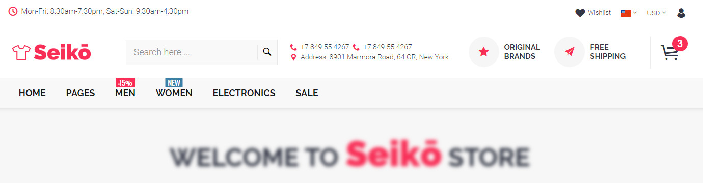 |
ShortCode |
| Variant 8 | .variant-8 | Three rows
department menu, search, promo block, address block |
 |
ShortCode |
| Variant 9 | .variant-9 | One row
creative, collapsed links |
 |
ShortCode |
Sticky Header
Use these classes with the headers making them sticky. Your can make sticky every headers variant.
| Style class | Description | Example |
|---|---|---|
| .sticky + .always | Always fixed header on scroll.
|
ShortCode |
| .sticky + .smart | Show fixed header only when scroll page to the top.
|
ShortCode |
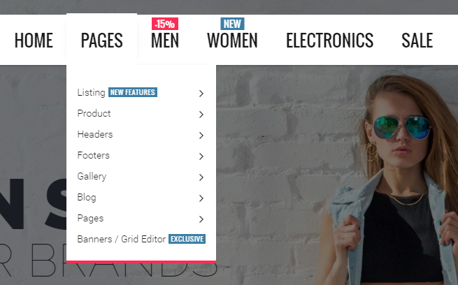
MegaMenu
We provides a very usefull way to customize your menu.
Each menu item can be displayed in three different variants: no dropdown link, simple dropdown and megamenu link.
Here is the basic megamenu structure:
MegaMenu Effects
Darkness
Seiko Template has darken effect on the screen when dropdown menu is open. If you want to use this effect add .blackout class to .megamenu
BlackOut on
BlackOut off

Dropdown Animations
Seiko Template has two effect for dropdown animation: fadeIn and slideTop. If you want to use one of this effects add .fadein or .slidetop class to .megamenu
Simple DropDown Link
Here is the Simple DropDown Link code example:
You can use unlimited levels of submenus.
MegaMenu DropDown Link
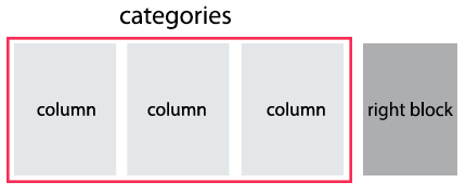
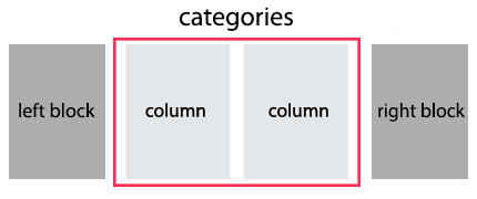
Schematic Layout of Megamenu dropdown:

You can use the megaMenu in 2,3,4 & 5 Columns. Also you can add Left and(or) Right custom block to the megaMenu. MegaMenu grids and codes are provided below:
| Description | MegaMenu Grid | Code Example |
|---|---|---|
Only categories columms |
Categories.column-5, .column-4, .column-3, .column-2, .column-1
5 column
|
|
Left Block + Categories |
Left Block.width-20, .width-25, .width-33, .width-40
Categories.column-5, .column-4, .column-3, .column-2, .column-1
 |
|
Right Block + Categories |
Right Block.width-20, .width-25, .width-33, .width-40
Categories.column-5, .column-4, .column-3, .column-2, .column-1
|
|
Left Block + Right Block + Categories |
Left Block.width-20, .width-25, .width-33, .width-40
Right Block.width-20, .width-25, .width-33, .width-40
Categories.column-5, .column-4, .column-3, .column-2, .column-1
|
|
Categories + Top HTML + Bottom HTML |
Categories.column-5, .column-4, .column-3, .column-2, .column-1

|
|


Truncated List
If the category in MegaMenu contains a very long list, you can hide a part of it. Use this html structure in your code:
Category Name view all... view less...
The attribute data-list-items="7" makes visible only 7 items of the list. To view all items, you should click the link 'view all'.

Mobile Menu
Mobile Menu is visible only when window is smaller than 992px. Its srtucture is provided below.
Mobile Menu Helper Classes
Use these classes with .mobilemenu
| Style class | Description |
|---|---|
.dblclick |
First click on link will open submenu, second click will go to the URL specified for that link
|
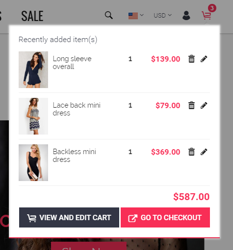
MiniCart
Header MiniCart
Seiko Template has two minicart view designs: Compact and Fullwidth.
The HTML code is equal for both design, just toggle class for .header-cart
| Minicart Types | Style class | Image | Example |
|---|---|---|---|
| Compact | .variant-1 |
 |
Show in action |
| Fullwidth | .variant-2 |
 |
Show in action |
Bottom MiniCart
Also you can use minicart variant with awesome 'fly to cart' animaton.
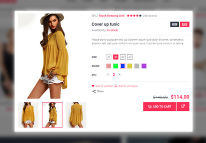
Product
Product Preview Types
You can choose between 5 types of product previews while creating your pages. Products type 1, and 3 has the same HTML structure. Its enough to change wrapper class to get the new preview type. Products type 5 and 6 has different html code structute, you need change class and HTML code to get these previews types.
Product preview HTML code must be placed inside wrapper div .products-grid or .products-listview
...
All previews type contains such items as: big image photo, inside slider or small thumbnails for more photos view, product name block, description block, price block, rating block, labels (new/sale), sharing link, action button, quick view link, wishlist link, not available block.
The list of product types & its descriptions are provided below:
| Product Types | Style class | Description | Image | Code |
|---|---|---|---|---|
| Variant 1 | .product-variant-1 |
Left Photo / Right Info Inside slider |
 |
ShortCode |
| Variant 2 | .product-variant-2 |
Left Photo / Right Info Inside slider Recomended use only in products carousel |
 |
ShortCode |
| Variant 3 | .product-variant-3 |
Top Photo / Bottom Info Inside slider |
 |
ShortCode |
| Variant 4 | .product-variant-4 |
Top Photo / Bottom Info Zoom on Hover Small previews |
 |
ShortCode |
| Variant 5 | .product-variant-5 |
Top Photo / Bottom Info Collapsed info Inside slider |
 |
ShortCode |
CountDown
You can put a countdown in the product preview or in the product pages of your shop and use it to highlight certain offers or deals.
There are two ways to set the final countdown date. Please see them below:
| Description | Code |
|---|---|
Set attribute data-promodate. In this case countdown date will end at set date. |
|
Set attribute data-promoperiod. In this case countdown date will never end and calculates as current date add attribute value in seconds. For example, data-promoperiod="100000000" will set promo period as 1d 03h 46m 40s. |
|
For more details on the countdown plugin, please visit its dedicated website.
Quick View
Quick View adds the possibility to have a quick preview of the products right from product list. Quick View content is placed in quick-view.html and loads into modal window via ajax. So this feature will work only on server side, not locally.
For use QuickView add URL to a.quick-view-link and place modal window code at the end of the page:
Quick View
Product Carousel
You can display product previews as carousel. For use carousel add class .products-carousel
to product previews wrapper:
...
Then initialize carousel with your parameters:
For more details on the carousel plugin, please visit its dedicated website.
Products Isotope Filter
You can display product previews as masonry grid with category filters. Add filters HTML code before products grid:
To make category selected on page load, add class to it .active. For example, this code will select all products from category "New" at start.
Products Page
Seiko Template has two product view designs: Classic and Creative. Creative design recomended to use only if product has 3 or more images.
In Classic design you can change product image size (large, medium, medium-plus and small).
Classic
Creative


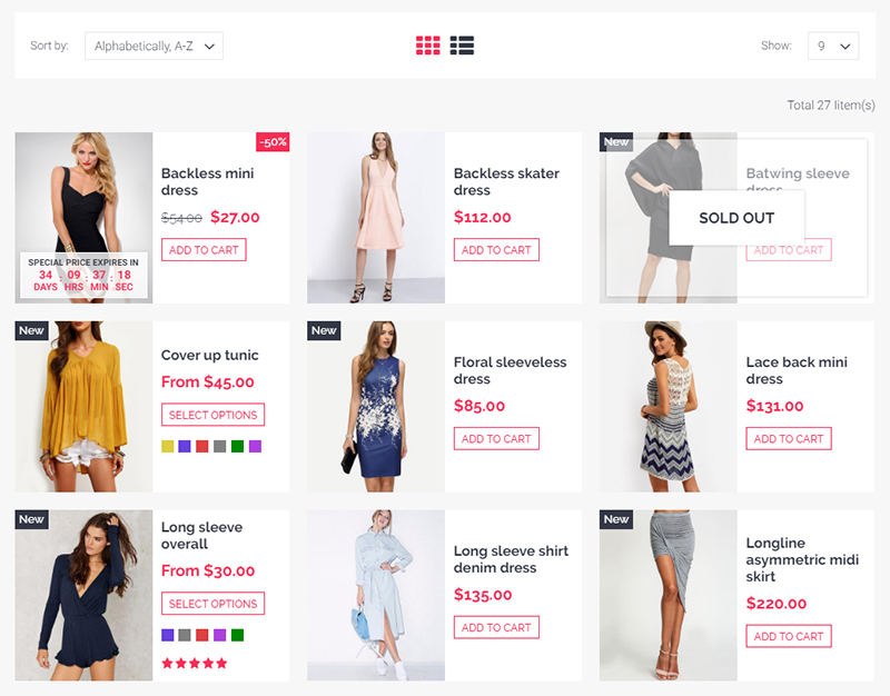
Products Listing
Products Per Row
You can display product listing however you like by changing product preview variant and number of products per row. Available values for number of products per row are: 2 / 3 / 4 / 5 / 6. For changing this number just add class .two-in-row,.three-in-row,.four-in-row,.five-in-row OR .six-in-row to .products-grid.
Look at this shortcode to view example.

Grid/List View
You can display product listing like grid or like list view. The grid view is default. The list view arranges products in a vertical list and pulls in the excerpt to give a more detailed overview.
Look at this shortcode to view list view.
Also you can use Grid / List toggle button to your product listing allowing users to toggle between grid / list views.
Grid View
List View

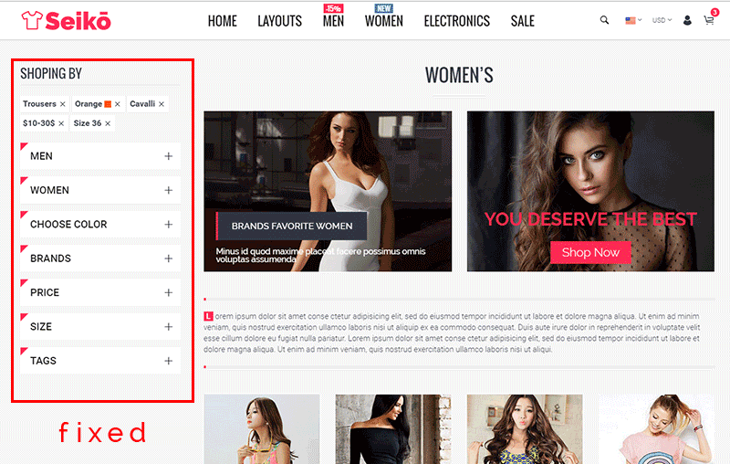
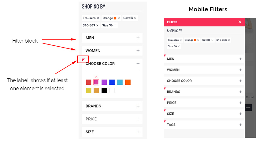
Sidebar Filter
The template has a ready-to-use filter blocks: categories, colors, sizes, prices, tags. You can place them to the left or right column.
Sidebar filter can be fixed on scroll or static. If sidebar is fixed all filter blocks are collapsed as accordion. If static - filter blocks are static and groups are opened
Fixed Sidebar
You can use stripe animation with filter block to show loading while ajax request. Just add .block-loading class to .sidebar-block:

Footer
Footer Types
You can choose between 4 types of footers while creating your pages. The list of footer type & its descriptions are provided below
| Footer Variant | Style class | Description | Image | Code |
|---|---|---|---|---|
| Variant 1 | .variant1 |
One row
promo block, copyright block |
 |
ShortCode |
| Variant 2 | .variant2 |
Three rows
newsletter block, footer links block, contact block, promo block, copyright block |
 |
ShortCode |
| Variant 3 | .variant3 |
One row
footer menu block, copyright block |
 |
ShortCode |
| Variant 4 | .variant4 |
Three rows
newsletter block, news carousel, social widget, footer links block, contact block, promo block, copyright block |
 |
ShortCode |
Slider
Slider structure
Seiko Template uses Swiper Slide. Swiper - is the free and most modern mobile touch slider with hardware accelerated transitions and amazing native behavior. It is intended to be used in mobile websites, mobile web apps, and mobile native/hybrid apps. Designed mostly for iOS, but also works great on latest Android, Windows Phone 8 and modern Desktop browsers
You can find the Swiper Slider related Documentation here.
Here is the HTML code for the Swiper slider:
If you plan to set previews of each slide, please set attribute data-thumb="true" to and data-thumb to .swiper-slide. If parameter data-thumb for slide is not specified, the preview image will be the same as the main image.
If you want to make slider image as link, set parameter data-href to .swiper-slide
Sliders animation
You can animate text, button or caption inside every slide via data parameters.
TextButton (big and small)Your Text
 SHOP NOW
 SHOP NOW
Caption with text
Your TextYour Text
Slide text/caption data parameters are provided below:
| Parameter | Description | Recomended Value | |
|---|---|---|---|
| data-delay | Delay after previous text animation in ms | 0 ... 10000 | data-delay="0" |
| data-fontsize | Font size in relative value (vw)
1vw = 1% of viewport width |
0 ... 30 | data-fontsize="4" |
| data-fontline | Line height in em (default is 1.2em)
1em equal to fontsize value, 2em equal to fontsize*2 |
0.8 ... 3 | data-fontline="1.5" |
| data-fontfamily | Font Family | - | data-fontfamily="Geneva" |
| data-fontcolor | Font Color (default is white) | - | data-fontcolor="red"
OR data-fontcolor="#ff0000" |
| data-fontweight | Font weight | normal (400)
bold (700) lighter bolder OR numeric value: 100, 200, 300, 400, 500, 600, 700, 800, 900 |
data-fontweight="bold"
OR data-fontweight="700" |
| data-ypos | Y (vertical) position in % | 0...100
center |
data-ypos="30"
OR data-ypos="center" |
| data-xpos | X (vertical) position in % | 0...100
center left right |
data-xpos="20"
OR data-xpos="left" |
| data-animate | Text appear animation | bounce, flash, pulse, rubberBand, shake, headShake, swing, tada, wobble, jello, bounceIn, bounceInDown, bounceInLeft, bounceInRight, bounceInUp, bounceOut, bounceOutDown, bounceOutLeft, bounceOutRight, bounceOutUp, fadeIn, fadeInDown, fadeInDownBig, fadeInLeft, fadeInLeftBig, fadeInRight, fadeInRightBig, fadeInUp, fadeInUpBig, fadeOut, fadeOutDown, fadeOutDownBig, fadeOutLeft, fadeOutLeftBig, fadeOutRight, fadeOutRightBig, fadeOutUp, fadeOutUpBig, flipInX, flipInY, flipOutX, flipOutY, lightSpeedIn, lightSpeedOut, rotateIn, rotateInDownLeft, rotateInDownRight, rotateInUpLeft, rotateInUpRight, rotateOut, rotateOutDownLeft, rotateOutDownRight, rotateOutUpLeft, rotateOutUpRight, hinge, rollIn, rollOut, zoomIn, zoomInDown, zoomInLeft, zoomInRight, zoomInUp, zoomOut, zoomOutDown, zoomOutLeft, zoomOutRight, zoomOutUp, slideInDown, slideInLeft, slideInRight, slideInUp, slideOutDown, slideOutLeft, slideOutRight, slideOutUp | data-animate="flipInY" (all example here) |
| data-otherstyle | Other inline styles | - | data-otherstyle="font-style: italic; padding:5px;" |
SEIKO demo sliders example
| Image | Code |
|---|---|
 |
|
 |
|
 |
|
 |


Other Content
Typography
You can see all typography elements in this example shortcode.
Brands
You can choose between 2 types of brands view while creating your pages. Its descriptions are provided below
| Description | Image | Code |
|---|---|---|
Brands carousel |
 |
ShortCode |
Brands grid |
 |
ShortCode |
Contact Form
Seiko Template has a 'ready to use' contact form that you can simply add to your website. The HTML form validation script makes sure the data sent through the form is accurate and well formatted. Just add contact form shortcode and change the email recipient address in contact.php.
Widgets
Google Map
Use this shortcode to add google maps on your website.
For adding your address to Google Map just change coordinates (latitude longitude) in JS code:
position: new google.maps.LatLng(64.127182, -21.817184)
If you want to change google maps color scheme generate it in Snazzy Maps Website
Use this shortcode to add instagram on your website.

For adding your instagram account just change accessToken in JS code:
accessToken: 'your code'
For more details on the Instagramm Feed, please visit its official website.
Credit
Seiko Template uses jQuery plugins and CSS library provided below:
- jQuery- JavaScript Library
- Bootstrap- Bootstrap by Twitter
- Swiper Slider- jQuery slider plugin
- Slick- jQuery carousel plugin
- Isotope- jQuery plugin filter & sort plugin
- Images Loaded - jQuery plugin for detect when images are loaded
- Parallax jQuery plugin- jQuery plugin for parallax effect
- jQuery Countdown- jQuery Countdown plugin
- Magnific Popup- jQuery popup plugin
- jQuery elevateZoom- jQuery imagezoom plugin
- jQuery ezPlus- jQuery imagezoom plugin
- jQuery Validation Plugin
- jQuery Form Plugin
- jQuery DarkTooltip
- jQuery Instagram Feed
- jQuery Tocca- plugin for detect Javascript events
- jQuery Bootstrap TabCollapse
- jQuery Parallax plugin
- CSS Animation Library
Hope you will enjoy Seiko Template!
Kind Regards,
BigSteps