...
...
We would like to thank you for purchasing Goodwin eCommerce HTML Template!
Before you get started, please be sure to always check out this documentation.If You have any questions that are beyond the scope of this documentation, please feel free to submit ticket to http://big-skins.com/support
We're very happy to help you and you will get reply from us more faster than you expected.
Thank you, we hope you to enjoy using Goodwin eCommerce HTML5 Template!
Follow the steps below to get started with your site template:
Goodwin Template follows a simple HTML code structure for every page. Here is the sample:
... .........
Goodwin Template supports boxed & fullwidth page content blocks.
If you add class .boxed or .fullwidth to the <body>, each content section that has class global_width becomes .boxed or .fullwidth.
You can make each separate content section (.holder) boxed, fullwidth or fullboxed by adding .boxed, .fullwidth or .fullboxed class instead of .global_width.
See the image below:

The CSS files are used to change the template appearance like fonts-size, font-color, backgrounds, paddings, margins etc. You can edit the css files with any Code Editing Software.
You can find all .css files in the folder html/css.
For helping developers write more succinct CSS, and to keep files organized we use Scss preprocessor. It is basically a scripting language that extends CSS and then compiles it into regular CSS (style-light.css or style-dark.css).
You can find all .scss files in the folder html/scss.
In the file scss\_variables.scss you can change any settings for change your site color scheme. All variable names are as clear as possible and do not need a description.
For example, for changing the buttons colors you need to change this variables:
//buttons
$button_color: #fff !default;
$button_bg: $custom_color !default;
$button-hover_color: #fff !default;
$button_hover_bg: #000 !default;
$button_bg_grey: #bcbcbc !default;
You can use template in the light mode or in the dark mode.
For light mode add the file style style-light.css
For dark mode add the file style style-dark.css
Goodwin Template has 10 different layouts. Each layout has own color scheme and own ready to use style file.
For example, if you like nutrition layout in light mode, then add the file style style-nutrition_1_dark.css
If you want to change the Google Font, you will need to edit the above links with your own font. If you want to use self hosted font, remove these links completely.
Goodwin Template uses Bootstrap Grid.
For more details on the Bootstrap Grid, please visit its official website.
You can choose between 11 types of headers while creating your pages. The list of header type & their descriptions are provided below
| Header Variant | Description | Image | Demo Link |
|---|---|---|---|
| Variant 1 | Topline + One row |  |
Example |
| Variant 2 | One row + Navigation menu row |  |
Example |
| Variant 3 | Topline + One row & Slide menu |  |
Example |
| Variant 4 | Topline + One row |  |
Example |
| Variant 5 | Topline + One row + Navigation menu row |  |
Example |
| Variant 6 | One row + Navigation menu row |  |
Example |
| Variant 7 | One row + Navigation menu row |  |
Example |
| Variant 8 | One row & Slide menu |  |
Example |
| Variant 9 | One row + Navigation menu row |  |
Example |
| Variant 10 | One row + Bottom line |  |
Example |
| Variant 11 | One row + Slider + Vertical links |  |
Example |
Use these classes with the headers elements to modify it.
| Style class | Description | Example |
|---|---|---|
| hdr.hdr_sticky | Sticky header on scroll.
|
Example |
| hdr.hdr--transparent | Transparent header
|
Example |
| hdr.hdr--light | Light color header (for dark background)
|
Example |
| hdr.hdr--dark | Dark color header (for light background)
|
Example |
| hdr.hdr--dark-drop | Dark background header dropdowns
|
Example |
| hdr.minicart-icon-style-1 hdr.minicart-icon-style-2 hdr.minicart-icon-style-3 hdr.minicart-icon-style-4 |
Header cart icon style
|
Example 1 Example 2 Example 3 Example 4 |
| .hdr-topline.hdr-topline--dark | Dark background header topline
|
Example |
| .hdr-topline.hdr-topline--color | Color background header topline
|
Example |
You can choose between 2 types of mobile headers while creating your pages. Mobile header variants & their descriptions are provided below
| Mobile Header Variant | Description | Image | Demo Link |
|---|---|---|---|
| Variant 1 | Two rows |  |
Example |
| Variant 2 | One row |  |
Example |
We provides a very usefull way to customize your menu.
Each menu item can be displayed in three different variants: no dropdown link, simple dropdown and megamenu link.
Here is the basic megamenu structure:
Here is the Simple DropDown Link code example:
You can use unlimited levels of submenus.
You can use the megaMenu in 2,3,4 & 5 Columns. Also you can add Left and(or) Right custom block to the megaMenu. MegaMenu grids and codes are provided below:
| Description | MegaMenu Blocks | Code Example |
|---|---|---|
Only categories columms |
Categories.column-5, .column-4, .column-3, .column-2, .column-1
5 column |
|
Left Block + Categories Columns |
Left Block.width-20, .width-25, .width-33, .width-40
Categories Columns.column-5, .column-4, .column-3, .column-2, .column-1 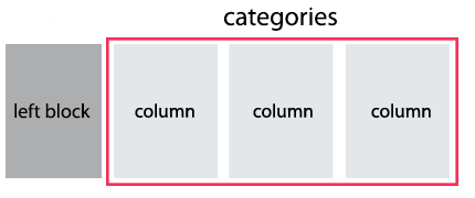 |
|
Right Block + Categories Columns |
Right Block.width-20, .width-25, .width-33, .width-40
Categories Columns.column-5, .column-4, .column-3, .column-2, .column-1

|
|
Left Block + Right Block + Categories Columns + Bottom Row |
Left Block.width-20, .width-25, .width-33, .width-40
Right Block.width-20, .width-25, .width-33, .width-40
Categories Columns.column-5, .column-4, .column-3, .column-2, .column-1
Bottom Row
|
|

You can choose between 6 types of product previews. Product preview code contains such items as: big image photo, small thumbnails for more photos view, product name block, price block, rating block, labels (new/sale), action button, quick view link, wishlist link, not available block.
The list of product types & their descriptions are provided below:
| Product Types | Description | Image | Code |
|---|---|---|---|
| Variant 1 | Vertical card with hover effect In this version there are 2 types of hover effect. 1 - Hidden button appears at the bottom 2 - Hidden button appears at the bottom and content slides up ( .prd.prd-style2)
|
 |
Example 1 (Recomended products section)
Example 2 |
| Variant 2 | Horizontal Card + Heading |  |
Example (Bestseller product) |
| Variant 3 | Horizontal Card with Quick view |  |
Example (Bestseller section) |
| Variant 4 | Simple Horizontal Card |  |
Example (Top Rated section) |
| Variant 5 | Simple Vertical card |  |
Example (Top Rated section) |
You can put a countdown in the product preview or in the product pages of your shop and use it to highlight certain offers or deals.
There are two ways to set the final countdown date. Please see them below:
| Description | Code |
|---|---|
Set attribute data-promodate. In this case countdown date will end at set date. |
|
Set attribute data-promoperiod. In this case countdown date will never end and calculates as current date add attribute value in seconds. For example, data-promoperiod="100000000" will set promo period as 1d 03h 46m 40s. |
|
For product preview with countdown use class .prd.prd-has-countdown
For more details on the countdown plugin, please visit its dedicated website.
Quick View adds the possibility to have a quick preview of the products.
You can display product previews as a grid. Using classes (.data-show-*), you can set the number of products in a row at different breakpoints.
...
For more details on the carousel plugin, please visit its dedicated website.
You can display product previews as a carousel. For use carousel add class .prd-carousel.js-prd-carousel
to product previews wrapper:
...
For more details on the carousel plugin, please visit its dedicated website.
You can display product previews as masonry grid with category filters. Add filters HTML code before products grid:
								All
								Featured
								Sale
								New
To make category selected on page load, add class to it .active. For example, this code will select all products from category "New" at start.
All
Add class .js-product-isotope to products grid and filtered class (or classes) to each product inside it:
You can choose between 10 types of footers while creating your site. The list of footer type & their descriptions are provided below
| Footer Variant | Description | Image | Code |
|---|---|---|---|
| Variant 1 |
Light Background Shop features + Subscription + Columns + Bottom Row |
 |
Example |
| Variant 2 |
Dark Background Logo + Subscription + Columns + Bottom Row |
 |
Example |
| Variant 3 |
Light Background Logo + Columns + Subscription + Bottom Row |
 |
Example |
| Variant 4 |
Light Background Logo + Horizontal Menu + Bottom Row |
 |
Example |
| Variant 5 |
Light Background Columns |
 |
Example |
| Variant 6 |
Light Background Logo + Subscription + Columns + Bottom Row |
 |
Example |
| Variant 7 |
Dark Background Columns + Google Map |
 |
Example |
| Variant 8 |
Light Background Columns + Shop features + Bottom Row |
 |
Example |
| Variant 9 |
Light Background Subscription + Columns + Bottom Row |
 |
Example |
| Variant 10 |
Dark Background Subscription + Columns (special for t-shirts layout) |
 |
Example |
Goodwin Template uses main slider (BN Slider) built with Slick Slider. For more details about Slick Slider plugin, please visit its dedicated website.
Here is the HTML code for the BN Slider:
| Slider Block | Description | Additional Classes | |
|---|---|---|---|
| .bnslider-slide | Slide Item | For video slide add class .bnslider-slide--background-video
| |
| .bnslider-video | Video Wrapper | For video slide with play button.bnslider-video--boxFor video slide with background add class .bnslider-video--backgroundFor video slide with background video and play button add data data-type="background-box"For video slide with background video and without play button add data data-type="background" | |
| .bnslider-image | Slider Image (windows width >= 479px) | - | |
| .bnslider-image-mobile | Mobile Slider Image (windows width < 479px) | - | |
| .bnslider-text-content | Slider text caption | For vertical caption alignment add classes.txt-top .txt-middle .txt-bottom For horizontal caption alignment add classes .txt-left .txt-right .txt-center
|
|
| .bnslider-vert | Slider text wrapper | To limit text width to 50% add class.w-50
|
|
| .bnslider-text | Slider text item | To change font size add classes.bnslider-text--lg.bnslider-text--md.bnslider-text--sm.bnslider-text--xs.bnslider-text--xxsTo change text horizontal alignment inside caption add classes .txt-left .txt-right .txt-center
|
|
| .btn-wrap | Slider button wrapper | To increase the upper indent add class.double-mtTo change button horizontal alignment inside caption add classes .txt-left .txt-right .txt-center
|
|
| .bnslider-arrows | Slider arrows | Arrows shifted to right.bnslider-arrows--pullrightArrows shifted to left .bnslider-arrows--pullleftArrows in the boxed container (not fullwidth) .containerArrows fullwidth .container-fluid
|
|
| .bnslider-dots | Slider dots | Dots vertical .vert-dotsVertical Dots to right .vert-dots--rightVertical Dots to left .vert-dots--leftDots in the boxed container (not fullwidth) .containerDots fullwidth .container-fluid
|
You can animate text and button in each slide via data parameters.
TextButton
SHOP NOW
Slide text/button data parameters are provided below:
| Parameter | Description | Recomended Value | |
|---|---|---|---|
| data-delay | Delay after previous text animation in ms | 0 ... 10000 | data-delay="0" |
| data-fontsize | Font size in relative value (vw) 1vw = 1% of viewport width |
0 ... 30 | data-fontsize="4" |
| data-fontline | Line height in em (default is 1.2em) 1em equal to fontsize value, 2em equal to fontsize*2 |
0.8 ... 3 | data-fontline="1.5" |
| data-fontfamily | Font Family | - | data-fontfamily="Geneva" |
| data-fontcolor | Font Color (default is white) | - | data-fontcolor="red"OR data-fontcolor="#ff0000" |
| data-fontweight | Font weight | normal (400) bold (700) lighter bolder OR numeric value: 100, 200, 300, 400, 500, 600, 700, 800, 900 |
data-fontweight="bold"OR data-fontweight="700" |
| data-animate | Text appear animation | bounce, flash, pulse, rubberBand, shake, headShake, swing, tada, wobble, jello, bounceIn, bounceInDown, bounceInLeft, bounceInRight, bounceInUp, bounceOut, bounceOutDown, bounceOutLeft, bounceOutRight, bounceOutUp, fadeIn, fadeInDown, fadeInDownBig, fadeInLeft, fadeInLeftBig, fadeInRight, fadeInRightBig, fadeInUp, fadeInUpBig, fadeOut, fadeOutDown, fadeOutDownBig, fadeOutLeft, fadeOutLeftBig, fadeOutRight, fadeOutRightBig, fadeOutUp, fadeOutUpBig, flipInX, flipInY, flipOutX, flipOutY, lightSpeedIn, lightSpeedOut, rotateIn, rotateInDownLeft, rotateInDownRight, rotateInUpLeft, rotateInUpRight, rotateOut, rotateOutDownLeft, rotateOutDownRight, rotateOutUpLeft, rotateOutUpRight, hinge, rollIn, rollOut, zoomIn, zoomInDown, zoomInLeft, zoomInRight, zoomInUp, zoomOut, zoomOutDown, zoomOutLeft, zoomOutRight, zoomOutUp, slideInDown, slideInLeft, slideInRight, slideInUp, slideOutDown, slideOutLeft, slideOutRight, slideOutUp | data-animate="flipInY"
(all example here) |
| data-otherstyle | Other inline styles | - | data-otherstyle="font-style: italic; padding:5px;" |
You can see all typography elements in this example Example.
You can choose between 3 types of brands view while creating your pages. Their descriptions are provided below
| Description | Image | Example |
|---|---|---|
Brands carousel |
 |
Example |
Brands grid |
 |
Example |
Brands creative carousel |
 |
Example |
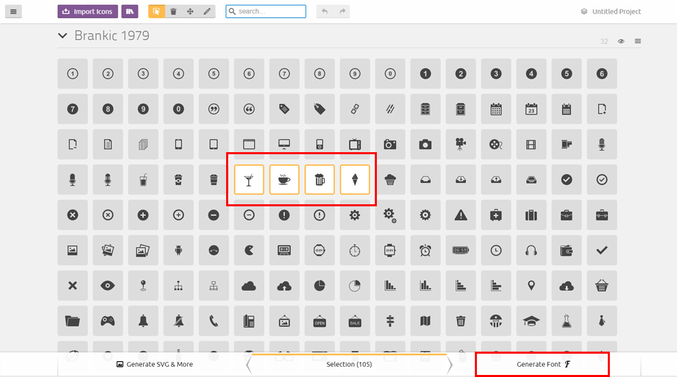
Goodwin Template uses simply and flexible icon library IcoMoon.
IcoMoon is striving to build and provide the best iconography and icon management tool for perfectionists.
If you want to add new icon to the library follow instruction, provided below:
1. Go to . Import font/icomoon-reg/selection.json. Select 'Yes' in modal window:
All Seiko icons will be imported!
2. Then select new icon(s)
3. Generate your custom font
4. Download new Icons Set, unzip archive and copy all files to 'font/icomoon-reg/' folder of your project
5. Find new icon in demo.html and use it in your html code
For example like this:
Goodwin Template uses jQuery plugins and CSS library provided below:.
Hope you will enjoy Goodwin Template!
Kind Regards,
BigSteps


